Our most recent unit for CyberARTS is about typography based animation. The video that I chosen to write about was "Alphagames", which was made by freelance editor and animator Evan Seitz.
The first example of principals of animation (that I noticed) was 6 seconds into the video, when the letter B was shown in the centre. This was an example of staging, as the B was in focus, while the sides of the screen were empty space.
The second example is at 24 seconds in, which shows an example of slow in and slow out animation. This is shown by the sphere slowly rotating and moving toward the camera, then slowly moving back after getting close.
The third example is 34 seconds in, which shows an example of overlapping action animation. The way the overlapping action is shown is by having the cube bounce into the frame after a moment, then having the portal behind where the cube lands open up to show the cube. (And it continues like that.)
One more example is 9 seconds in, with the letter C, which shows Arcing animation. The arc is shown by the C moving around before stoping In position, with the C arcing around the other C before stopping in place.
The pacing of the video is somewhat fast paced, but not too fast, so the viewer can still understand the visuals. There isn't any speaking in the video, but the sounds/music in the video consists of sounds or music from the game that is currently on screen. Overall, a pretty neat kinetic typography video.
Wednesday, 14 June 2017

Tuesday, 11 April 2017
Still life Drawing
For the last few weeks, we were assigned our first still life drawing. Our drawings consisted of flowers, animal skulls, a stuffed bunny, and a small statue figure. My drawing included the statue figure, a small bunch of flowers, and one animal skull on top of a table surface.

We started this assignment by having to draw a few rough drafts of all the different things on the table, and each person had to draw what they could see from where they were sitting. This was so drawings of the same things could look different with different angles and perspectives. We had to start with drawing all of the contour lines, and then shading in everything lightly before adding the darker shades to any darker spots. After we had finished 3-4 rough drafts, we had to choose 1 of the drawings to add value and shading to. This was to decide on the image to use for the full sized still life. For the still life drawing, we mostly repeated the same process for the 1 rough draft that was chosen. The only differences were the sizes and more detail in the shading.
For each still life drawing, we had to have a composition, such as diagonal or L-composition. The Composition I used for my still life is L-composition. The composition in this picture is created by the placements of the objects (Focal point). The statue was drawn in first to get an idea of how much space the flowers and skull would have to make an L-composition. I drew the tabletop that the objects were on to leave open space at the bottom to make to bottom part of the L-composition. With the focal point taking up the middle, left and most of the top of this still life, the remainder of the drawing creates the L-shape/L-composition with the negative space. I tried to make sure that the empty space is this drawing would seem purposeful, but wouldn't take away from the drawing.

For each still life drawing, we had to have a composition, such as diagonal or L-composition. The Composition I used for my still life is L-composition. The composition in this picture is created by the placements of the objects (Focal point). The statue was drawn in first to get an idea of how much space the flowers and skull would have to make an L-composition. I drew the tabletop that the objects were on to leave open space at the bottom to make to bottom part of the L-composition. With the focal point taking up the middle, left and most of the top of this still life, the remainder of the drawing creates the L-shape/L-composition with the negative space. I tried to make sure that the empty space is this drawing would seem purposeful, but wouldn't take away from the drawing.
Monday, 27 March 2017
Digital Portrait assignment (Year 2 CyberARTS)
For this assignment, we were required to choose an art style (from the last 100 years), and apply it to a self portrait. The style I chose is Pop art.
This is the image of my digital self portrait:
 For my self portrait, I wanted to choose pop art since is a style that i really appreciate the look of. I wanted to go for more of a multi-coloured pop art style, as apposed to the simple 1-2 colours total pop art style.
I started with the background of the image, which from the start, I knew i wanted to include the question mark to fit the pose in the photo. I wasn't sure what i wanted for the skin tone, but I decided to make it slightly darker then the actual skin tone, and more pinkish. I used to cutout filter to get the rest of the colours for this image. (other than the question mark and background, which were made with the paint tool)
Overall, I wasn't as satisfied as I could've been with how this project turned out, but I do like how it turned out in the end.
This is the image of my digital self portrait:

I started with the background of the image, which from the start, I knew i wanted to include the question mark to fit the pose in the photo. I wasn't sure what i wanted for the skin tone, but I decided to make it slightly darker then the actual skin tone, and more pinkish. I used to cutout filter to get the rest of the colours for this image. (other than the question mark and background, which were made with the paint tool)
Overall, I wasn't as satisfied as I could've been with how this project turned out, but I do like how it turned out in the end.
Tuesday, 28 February 2017
Rembrandt Lighting:
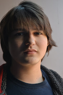
This photo is an example of rembrandt lighting because of the small triangle of light under the subject's eye.
Loop lighting:
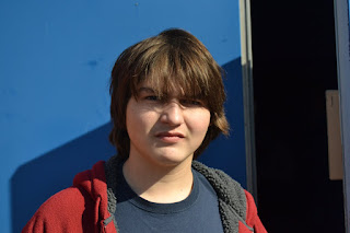
This photo is an example of loop lighting.
Butterfly/Glamour lighting:
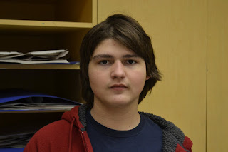
This is an example of butterfly lighting because of the butterfly-shaped/ odd shaped shadow underneath the subject's nose.
Split lighting:
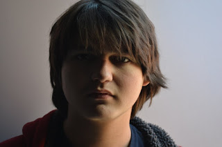
This photo is an example of split lighting due to half of the subject's face being dark, while the other half is facing the light/lit up.

This photo is an example of rembrandt lighting because of the small triangle of light under the subject's eye.
Loop lighting:

This photo is an example of loop lighting.
Butterfly/Glamour lighting:

This is an example of butterfly lighting because of the butterfly-shaped/ odd shaped shadow underneath the subject's nose.
Split lighting:

This photo is an example of split lighting due to half of the subject's face being dark, while the other half is facing the light/lit up.
Friday, 24 February 2017
Tuesday, 14 February 2017
How shutter speeds, apertures and ISOs work.
Our assignment for CyberARTS today was to find examples of images with different ISOs, Apertures and Shutter speeds.
Examples for aperture:
F4 shot Low aperture shot


Both of these shots are examples of low aperture shots because the backgrounds behind them are blurred, while the subjects are focused on.
High aperture shot High aperture shot
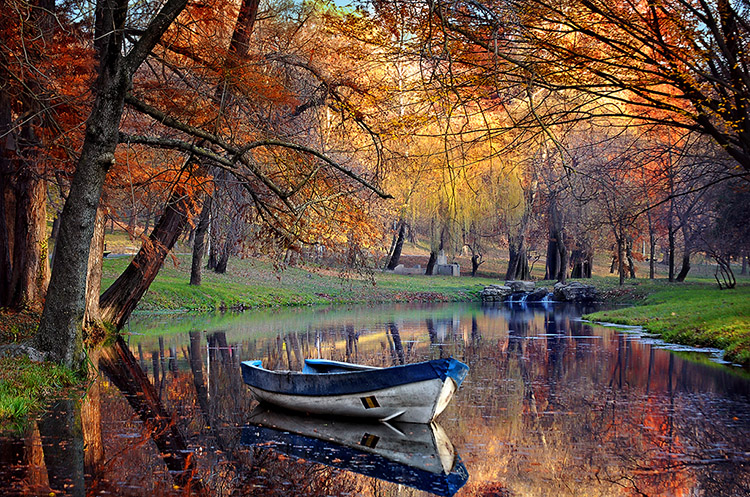

Both of these shots are examples of high aperture because the both have foregrounds and backgrounds (and everything in the shot) in focus, as apposed to selective focus.
Examples of shutter speeds:
Low shutter speed Low shutter speed
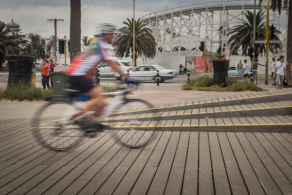

Both of these photos are examples of low shutter speeds because they both have movement and/or blur (caused by movement).
High shutter speed High shutter speed


Both of these photos are good examples of higher shutter speeds because they both show splashes of water, but there is no movement in the photo.
Examples of ISO:
Low ISO Low ISO

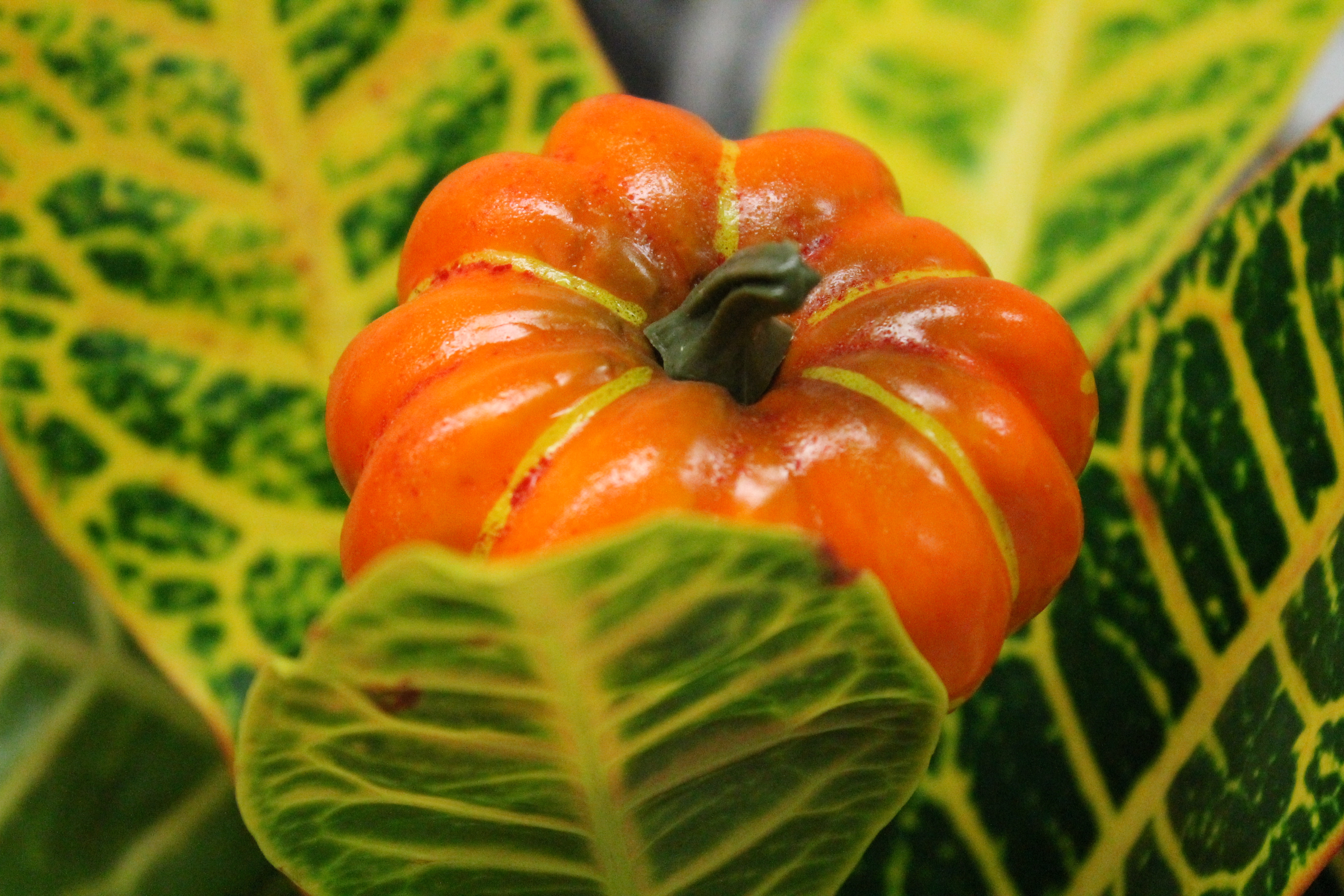
Both of these shots are low Iso because neither of them have much sensitivity to light, and neither of the shots are very bright.
High ISO High ISO
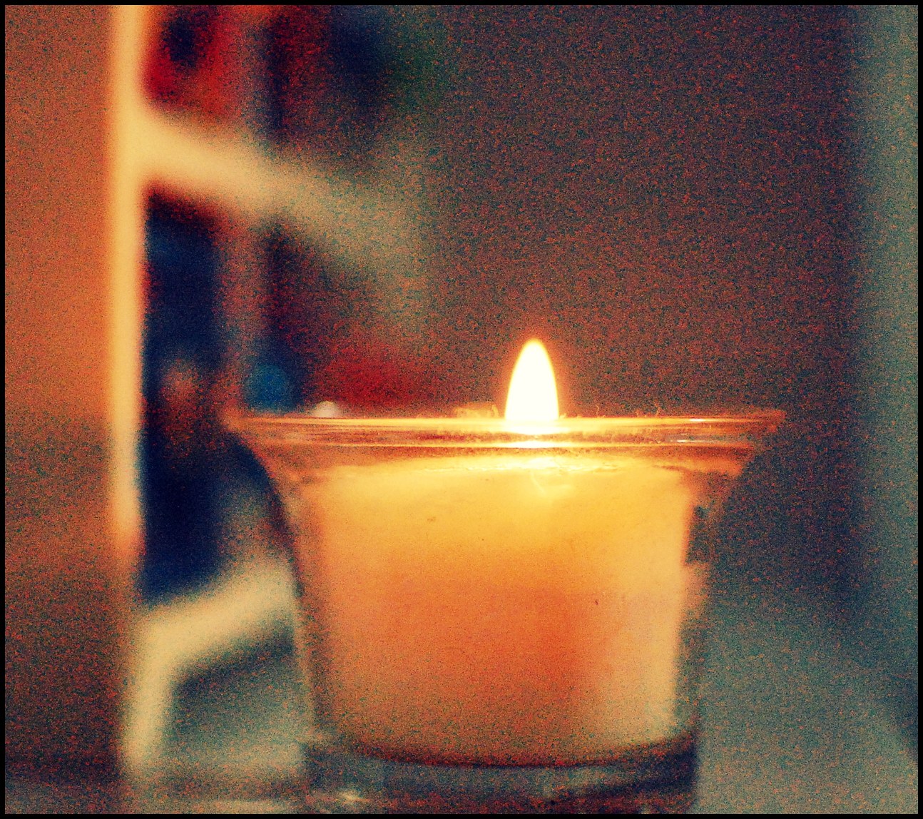

Both of these shots are examples of high ISOs because they are both very sensitive to the light in the photos, and are also somewhat grainy.
Our assignment for CyberARTS today was to find examples of images with different ISOs, Apertures and Shutter speeds.
Examples for aperture:
F4 shot Low aperture shot
Both of these shots are examples of low aperture shots because the backgrounds behind them are blurred, while the subjects are focused on.
High aperture shot High aperture shot
Both of these shots are examples of high aperture because the both have foregrounds and backgrounds (and everything in the shot) in focus, as apposed to selective focus.
Examples of shutter speeds:
Low shutter speed Low shutter speed
Both of these photos are examples of low shutter speeds because they both have movement and/or blur (caused by movement).
High shutter speed High shutter speed
Both of these photos are good examples of higher shutter speeds because they both show splashes of water, but there is no movement in the photo.
Examples of ISO:
Low ISO Low ISO
Both of these shots are low Iso because neither of them have much sensitivity to light, and neither of the shots are very bright.
High ISO High ISO
Both of these shots are examples of high ISOs because they are both very sensitive to the light in the photos, and are also somewhat grainy.
Saturday, 11 February 2017
For our second assignment for year 2 CyberARTS, we were told to find 20-25 portraits on Pinterest, and choose our favourite out of the ones that we saved, as well as explaining why it was our favourite.
The image I chose for my favourite is This one : and it is called Hidden Beauty II, made by Rudra Mandal, and found on Pinterest.

Lighting: The lighting from this image comes from the subject's left side, or the right side of the picture. This is shown by the side of the subject's face that is less show is the more lit-up side. The image shows very direct lighting on the lit-up side of the face, while the other half is very deep or "harsh" lighting, which is also displaying broad lighting because the "broad" side of the face is very dark, while the less shown side is very bright/ lit up.
Expression: The viewer isn't able to really identify the subject's expression, but from I get from the image is that the subject is trying to hide their identity, as trying to hide their face from the camera.
Background: The background doesn't display any props, and is just blank. The only thing noticeable about the background is that it blends with the lighting of the shot. Most of the background is black, but the part of the subject that is lit-up is surrounded by the only lit-up part of the background.
Pose and posture: The subject appears to be formal in this picture, as there is nothing silly or out of place in the image. The image is simply a formal image tat is a close up of the subject's face (or at least what part of their face isn't covered)
Eyes and direction of gaze: The subject's eyes are not looking towards the viewer/camera, but are looking in front of how they are positioned for the shot. Their eyes are shiny due to the placement of the lighting in the shot.
Colour and Contrast: Unless black and white count as colours, there is no colour in this image, but the relationship between shadows and contrast are the main focus of this image.
What I like about the image: The reason why I like this image is because it is a serious looking image, and the lighting and shadows present in the image are very well done. I like how this image looks overall, and i think the artist/photographer did really well.
Friday, 3 February 2017
My/Our first assignment of year two CyberARTS surrounds the different types of lighting and portraits for Photography. There are six different types that we are to research on. Here are examples of each.
1. Split lighting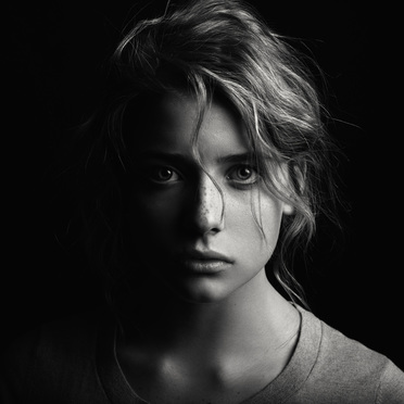 This type of lighting has light shine on only one side of the subject's face, while the other half is completely dimmed from light/has no light shining on it, making it dark.
2.Loop lighting Loop lighting is made by creating a small shadow of the subject's noses
on their cheeks. To create loop lighting, the light source must be
slightly higher than eye level and about 30-45 degrees from the camera.
Loop lighting is made by creating a small shadow of the subject's noses
on their cheeks. To create loop lighting, the light source must be
slightly higher than eye level and about 30-45 degrees from the camera.
3. Rembrandt Lighting Rembrandt lighting is identified by the triangle of light on the cheek.
Unlike loop lighting where the shadow of the nose and cheek do not
touch, in Rembrandt lighting they do meet which, creates that trapped
little triangle of light in the middle.
Rembrandt lighting is identified by the triangle of light on the cheek.
Unlike loop lighting where the shadow of the nose and cheek do not
touch, in Rembrandt lighting they do meet which, creates that trapped
little triangle of light in the middle.
4. Butterfly/Glamour lighting Butterfly lighting is aptly named for the butterfly shaped shadow that
is created under the nose by placing the main light source above and
directly behind the camera. The photographer is basically shooting
underneath the light source for this pattern. It is most often used for
glamour style shots and to create shadows under the cheeks and chin. It
is also flattering for older subjects as it emphasizes wrinkles less
than side lighting.
Butterfly lighting is aptly named for the butterfly shaped shadow that
is created under the nose by placing the main light source above and
directly behind the camera. The photographer is basically shooting
underneath the light source for this pattern. It is most often used for
glamour style shots and to create shadows under the cheeks and chin. It
is also flattering for older subjects as it emphasizes wrinkles less
than side lighting.
5. Broad loop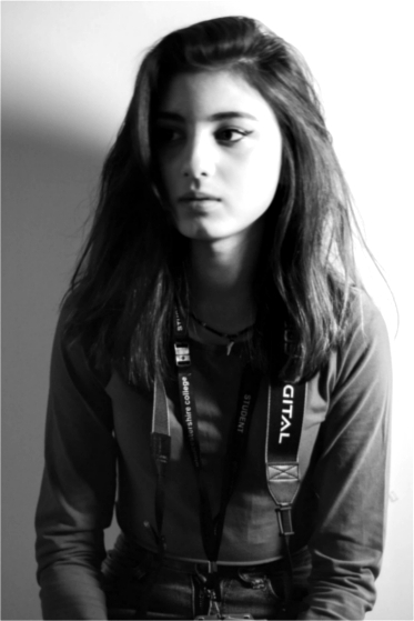 Broad lighting is when the subject’s face is slightly turned away from center, and the side of the face which is toward the camera (is broader)
is in the light. This produces a larger area of light on the face, and a
shadow side which appears smaller. Broad lighting is sometimes used for
“high key” portraits.
Broad lighting is when the subject’s face is slightly turned away from center, and the side of the face which is toward the camera (is broader)
is in the light. This produces a larger area of light on the face, and a
shadow side which appears smaller. Broad lighting is sometimes used for
“high key” portraits.
6. Short lighting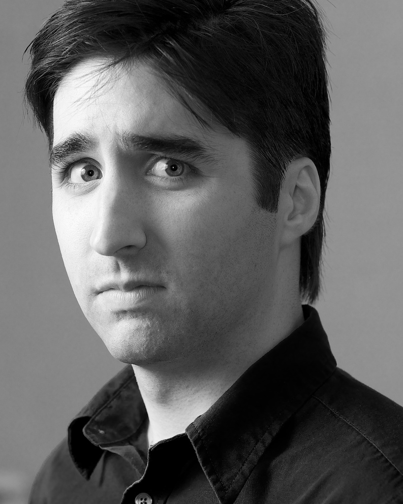 In short lighting, the face is turned towards the light source this
time. Notice how the part of the face that is turned away from the
camera has the most light on it and the shadows are falling on the near
side of the face, closet to the camera. Simply put short lighting has
shadows on the largest part of the face showing.
In short lighting, the face is turned towards the light source this
time. Notice how the part of the face that is turned away from the
camera has the most light on it and the shadows are falling on the near
side of the face, closet to the camera. Simply put short lighting has
shadows on the largest part of the face showing.
Source of information: http://digital-photography-school.com/6-portrait-lighting-patterns-every-photographer-should-know/
1. Split lighting
This type of lighting has light shine on only one side of the subject's face, while the other half is completely dimmed from light/has no light shining on it, making it dark.2.Loop lighting
Loop lighting is made by creating a small shadow of the subject's noses
on their cheeks. To create loop lighting, the light source must be
slightly higher than eye level and about 30-45 degrees from the camera.3. Rembrandt Lighting
Rembrandt lighting is identified by the triangle of light on the cheek.
Unlike loop lighting where the shadow of the nose and cheek do not
touch, in Rembrandt lighting they do meet which, creates that trapped
little triangle of light in the middle.4. Butterfly/Glamour lighting
Butterfly lighting is aptly named for the butterfly shaped shadow that
is created under the nose by placing the main light source above and
directly behind the camera. The photographer is basically shooting
underneath the light source for this pattern. It is most often used for
glamour style shots and to create shadows under the cheeks and chin. It
is also flattering for older subjects as it emphasizes wrinkles less
than side lighting.5. Broad loop
Broad lighting is when the subject’s face is slightly turned away from center, and the side of the face which is toward the camera (is broader)
is in the light. This produces a larger area of light on the face, and a
shadow side which appears smaller. Broad lighting is sometimes used for
“high key” portraits.6. Short lighting
In short lighting, the face is turned towards the light source this
time. Notice how the part of the face that is turned away from the
camera has the most light on it and the shadows are falling on the near
side of the face, closet to the camera. Simply put short lighting has
shadows on the largest part of the face showing.Source of information: http://digital-photography-school.com/6-portrait-lighting-patterns-every-photographer-should-know/
Monday, 11 January 2016
Wednesday, 2 December 2015
Surrealism Assignment presentation.
The latest assignment for our CyberARTS class was to research a artist that uses surrealism for their works. The artist that I chose was Erik Johansson. We were to research about the artist that we chose and to make a presentation about surrealism and the artist using Prezi. Below this is the link to my Prezi, should the one above not work.
http://prezi.com/bnfxku8tn3p2/?utm_campaign=share&utm_medium=copy&rc=ex0share
Thursday, 5 November 2015
Inuit Girls throat sing at Justin Trudeau's ceremony.
This week, Canada has elected its newest Prime Minister: Justin Trudeau. During the ceremony for him being sworn in as the prime minister, two young girls were invited to the front to throat sing for the audience.
The original link: http://www.cbc.ca/news/canada/north/inuit-throatsingers-steal-the-show-at-justin-trudeau-s-swearing-in-ceremony-1.3304148
The original link: http://www.cbc.ca/news/canada/north/inuit-throatsingers-steal-the-show-at-justin-trudeau-s-swearing-in-ceremony-1.3304148
Tuesday, 3 November 2015
Artist Statement

Thunderbird By Norval Morrisseau
Description: This painting was made by Norval Morrisseau, and it is called Thunderbird. The visual of the painting is the Large bird/the Thunderbird. Many of the lines are curved or wavy lines. This painting has multiple shapes in it, such as circles, ovals and lots of strange and cool looking shapes. There are plenty of colours in this painting. They include: Blue, Sky Blue, Yellow, Red, Orange, Bright Orange, Violet, Indigo, Pink, Green, and Teal.Analysis:The main focal point of this artwork is either the colour of the bird itself, as it pops out SO much with all of its colour. This picture is Asymmetrical, so it isn't the same on both sides, but it still looks really nice. This picture does not have any deep space to it, as it looks 2-d all around. Not many lines are repeated in this picture, but some lines look similar to other.
Interpretation: I don't think that there is a main sort of meaning or purpose behind this artwork. Not much is happening in this picture other than just the sight of the "Thunderbird" itself. I would say that the artist IS concerned with the lines, shapes, colours, and textures of this picture. A few words that could describe this artwork would include: exhaustion, fun, complexity of design, and beauty.
Judgment: In my opinion, the theory that best describes this artwork would be Formalism. (Making the viewer aware of lines, shapes, colours or design.) I do like this artwork because of how colourful it is. With all of these colours all over the "Thunderbird", it makes it nice and cool to look at and really see how much effort went into making this one painting.
Thursday, 22 October 2015


7 Grandfather Teachings Project
We were assigned a Project that had to do with the 7 Grandfather Teachings in our CyberARTS class. We were to research about the 7 Grandfather Teachings before picking a role to work on with a somewhat partner. My Partner's role was the Bear, which was a representation of Courage/bravery. We had to create a few rough copy drafts for our painting before we decided on our final one. After we finished making the visuals for the painting, we started doing the watercolour painting to give the picture colour. After we completed everything on the painting, we took pictures of our artwork with a camera to post on this blog.


Monday, 5 October 2015
First CyberARTS Assignment
Assignment:For homework this weekend, watch this video and post a response in your blog that indicates one or two things that you learned from Aaron Draplin about logo design from watching this video. Be ready to chat about it on Monday.
We were assigned to watch a video to do with CyberARTS over the weekend. The video had to do with Designing Logos, which is what The guy in the video does for a job. He did many designs for Shapes and the letter A. The video really helps with showing how to design fonts for a Logo.
We were assigned to watch a video to do with CyberARTS over the weekend. The video had to do with Designing Logos, which is what The guy in the video does for a job. He did many designs for Shapes and the letter A. The video really helps with showing how to design fonts for a Logo.
Friday, 25 September 2015
Rhythm assignment

Dynamic Rhythm

Steady Rhythm
In both of these images, I have created a sense of rhythm. My dynamic rhythm works and shows rhythm from the direction and thickness of the lines, and how some sets of lines look like a harp.(to me) The steady rhythm Works because of the direction and thickness of some of the lines, and how some lines look closer or farther then others. The dynamic rhythm is pleasing to look at because of all the different directions of lines and how some sets of lines have different thickness patterns. the steady line rhythm is pleasing to look at because of the the steady pattern they all go by, and how they create the illusion of distance.
Friday, 11 September 2015
The randomness begins.
First blog post.
I am a Cyberarts student at LCI. I don't know how often this will be updated, but whenever i do it will have to do with work in cyberarts or other stuff.
I am a Cyberarts student at LCI. I don't know how often this will be updated, but whenever i do it will have to do with work in cyberarts or other stuff.
Subscribe to:
Posts (Atom)